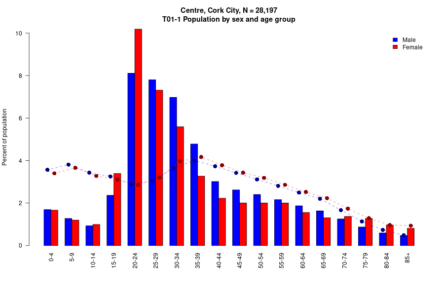
There are striking differences in the age and gender composition across Cork City, with an abundance of male, young and single people in the city centre. The absence of children, women and older people leads to several intersecting inequalities in access to education, work and housing that are effectively a tax on girls, women, disabled and old people. The increasing focus on single and small apartments – which may seem oppressive or even dangerous to women and disabled people – is transforming the city and the centre into a population of transients. The lack of family, own-front-door and accessible dwellings means that most of life’s transitions – forming a relationship, having a child, unemployment, retirement, disablement or long-term illness – necessitate a move, and the only available and appropriate dwellings are either in poor repair, or increasingly further away from the centre.
The renewal of small parts of Cork City disguises an ongoing decline and dereliction of large swathes of the city, with poor maintenance and high rents increasing the volume of substandard single occupancy dwellings in divided former family dwellings, high levels of neglected vacant property, and indeed physical collapse of older buildings.
Girls, women, disabled and older people experience a double burden of excess journey times to education, work and essential services, as a direct consequence of moving out of a centre and out of a city that increasingly lacks appropriate and secure housing.
A change in decision-making to more adequately include all parts of the community would change the direction of planning. The much-parroted term ‘sustainability’ is a nonsense when the city is unable to sustain its own residents across changes in family structure, sickness and employment.
(Click on the graphs or maps to enlarge them.)
Continue reading Gender and age inequalities in space and housing in Cork City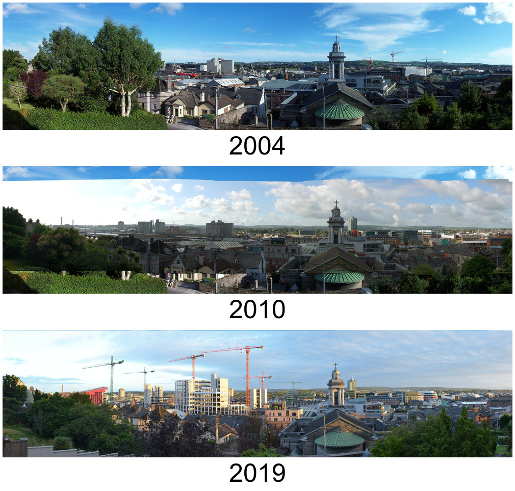

 The
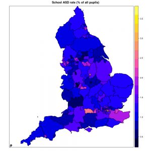
The 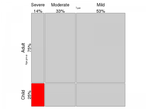 If autism was assumed to affect all people at all ages approximately equally, there are somewhere between 15,000 (1 in 300) and 100,000 (1 in 43) autistic people of all ages in the Irish population of 4.6 million. It should be noted that 75% of the Irish population is older than 18 years and most will not have been assessed or diagnosed, so many autistic people are unrecognized. Recognition is widening from “severe autism in childhood” to “mild autism” and to older ages, which is probably the largest factor driving increased autism prevalence. We have also moved from recognizing approximately one autistic pupil per school to recognizing one autistic child per class in the space of ten or fifteen years.