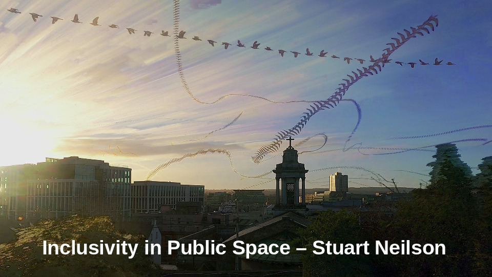
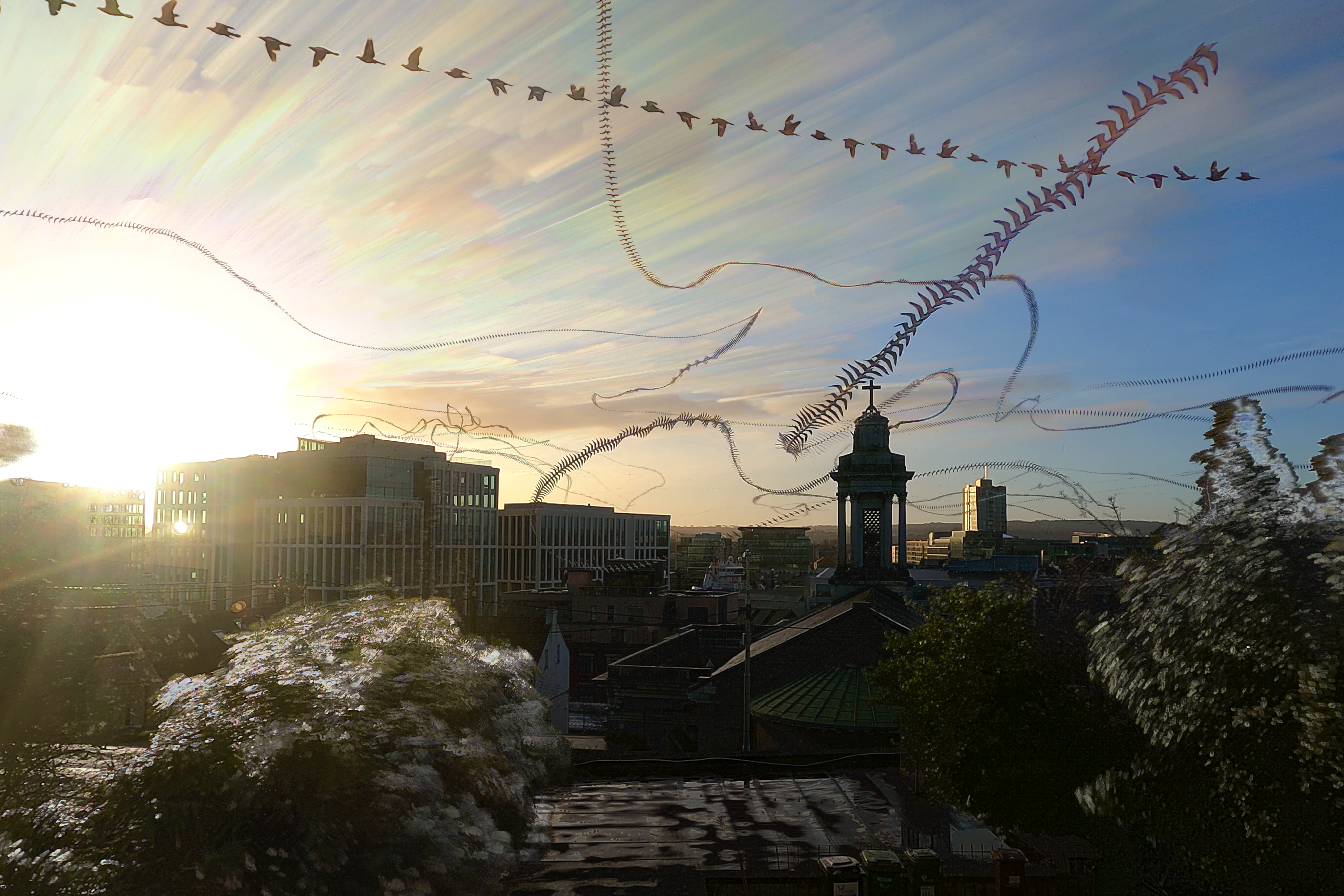
Cover image: “We are Cork” at City Hall, surrounded by sensory peaks of vision, music, flavour, aroma and texture.
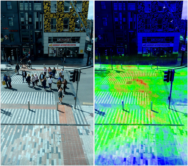
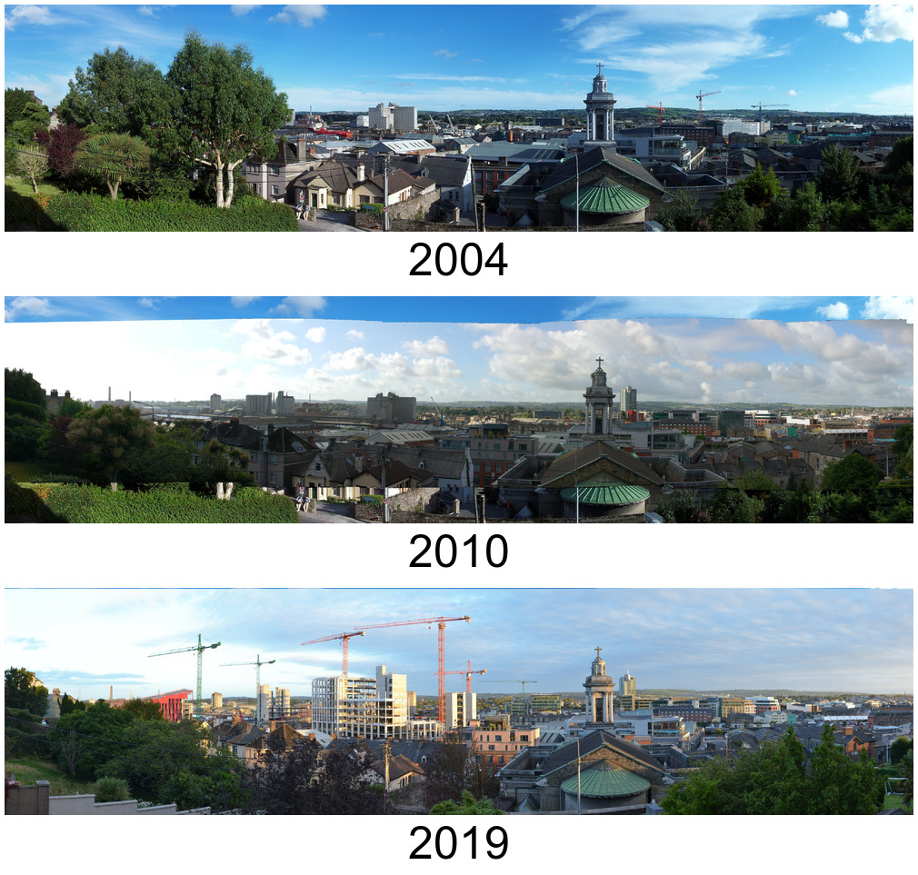
In 2024 a group of us, all autistic adults connected through the Aspect support service in Cork and Kerry, came together to design, conduct and report on our experiences of urban space. This concluded with our illustrated report “The Sensory City, Cork“.
During the course of our collaboration we had some focus group sessions and group walks through parts of Cork City to iteratively design and test a survey for a wider group of Aspect clients in Cork and Kerry. The survey was completed by 76 people, who were all invited to contribute, in words and pictures, to a set of conclusions and recommendations from the survey of our collective autistic experience of urban space.
The Aspect service, part of the Rehab Group, kindly provided meeting space and supported our communication and survey dissemination process.
Continue reading Mapping sensory-friendly networks