Whenever I enter busy public places I have difficulty identifying where to place myself in relation to crowds, and how to navigate to the places I want or need to reach. I have been using video – some recorded by me, some streamed online – to identify patterns of movement over public spaces, exposing the intensity of movement and potential sensory refuges.
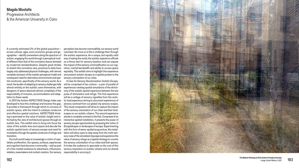
Some of these images and video were showcased as part of “A Case for Sensory Decolonisation: Autistic Escape” curated by Magda Mostafa as part of the Time Space Existence Collection at the 2023 Venice Architecture Biennale, hosted at the European Cultural Center’s Palazzo Mora.
The selected work represents an intersection between my attempts to explain my own experience of place, and Magda Mostafa’s ASPECTSS™ Design Index, an evidence based set of guidelines for autistic inclusion in the built environment.
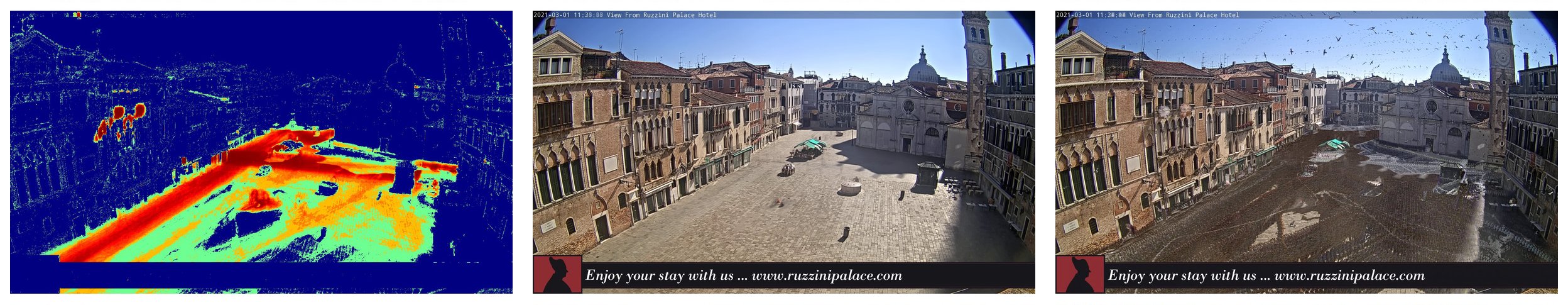
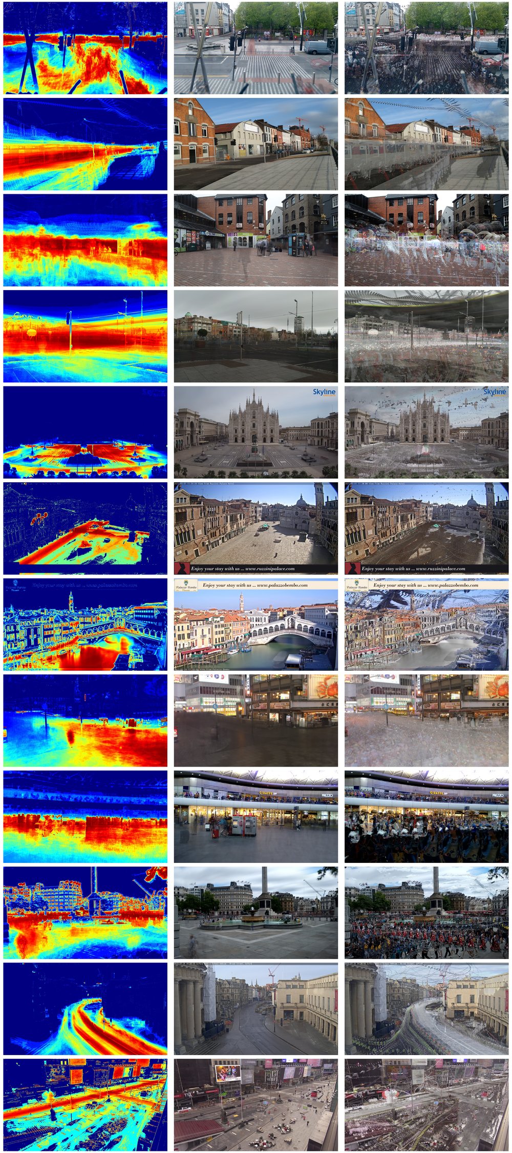
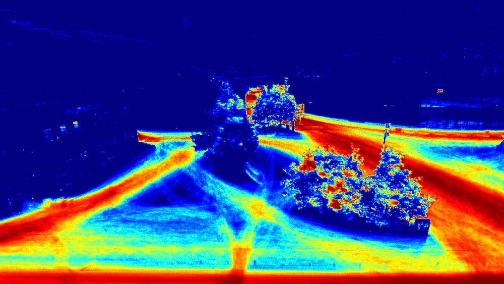
The images above are from a square in Venice, Campo Santa Maria Formosa, which I recorded from a live video streamed by Ruzzini Palace Hotel. The video is like a portal into another world, and this stream from March 2021 was one of many opportunities to see other places when travel was difficult due to the pandemic. As Will discovers in The Subtle Knife (Philip Pullman, 1997), “The sun on the grass beyond it was just like the sun on the grass on this side, except unaccountably different.” Will and Lyra’s first encounters with another world were particularly poignant watching the changing landscape of Broad Street in Oxford as it developed from high density vehicular traffic into a cycle and walking priority area in the last few years.
Live streaming video of real places and the amazing and growing collections of free cultural experiences offered by museum and gallery were a great release during the restrictions of the pandemic, and remain a great resource ever since.
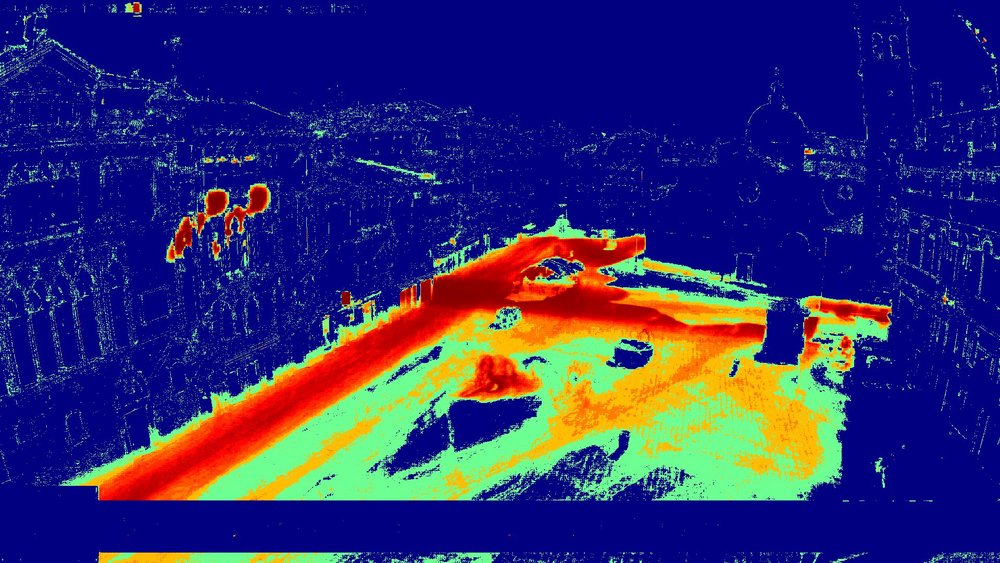
The areas of high and low motion are evident by accumulating the sum of changes at each pixel in the image, to create a map of motion intensity across the visual field. Of course some changes (such as a flashing light, or a TV) are not movement, and some movement (like the flags on the wall in Campo Santa Maria Formosa) is not traffic, but most of the changes are created by pedestrians or vehicles, and the processed image is a reasonable heatmap of motion intensity. Areas coloured red represent high intensity, and pick out busy paths from left to right and from the centre to the bottom left. Blue areas represent low intensity, and pick out the sky, building facades and some of the ground. Orange and green represent intermediate intensity of motion, a gradient from busy to calm.
There is a small triangular refuge in the middle of the square, with a curious hot-spot of movement next to it. This turns out to be, on viewing my video recording from 2021, a small group of children playing marbles on the ground. Their blurred outlines are visible in the long-exposure photo in the middle of the three-panel image at the head of this post. The children have reoccupied a part of this very busy tourist venue, decolonizing an attractive portion of lower intensity real estate, around which everyone politely leaves a wide berth. Venice has a resident population of 49,000 with 6,000 children under the age of 15. Venice hosts between 52,000 and 110,000 visitors every day throughout the year, and has more tourist beds than residents.
These images are my attempt to understand and communicate my own discomfort in public places, to identify the kinds of interstitial refuge where I would feel safe, and the routes I could use to navigate without too much sensory overload. Avoidance is loss of opportunity (for education, earning, company and leisure), so learning to safely wayfind through the sensory intensity of a city is beneficial. This optimisation of benefit against discomfort is covered in several of the ASPECTSS™ domains, Acoustics, Spatial Sequencing, Escape Space, Compartmentalization, Transitions, and Sensory Zoning. The guidelines help formalize the identification of types of refuge space, essential or desirable places, and the routes connecting them.
Multisensory exploration
When I look at one of my sensory composite images, I feel the weather on the day I recorded it, along with the sounds of birds and people, the smell of the sea in Cork, and the textures around me, as if these images have recorded more than just sight. However, we do have a real multisensory record in the audio tracks, and can make touchable versions of the image, representing motion with texture and depth. We can also process the video into timelapse sequences, or extract just the motion, recolour it, and render different aspects of the scene over the original recording. Multisensory works powerfully evoke their maker’s embodied sense of place.
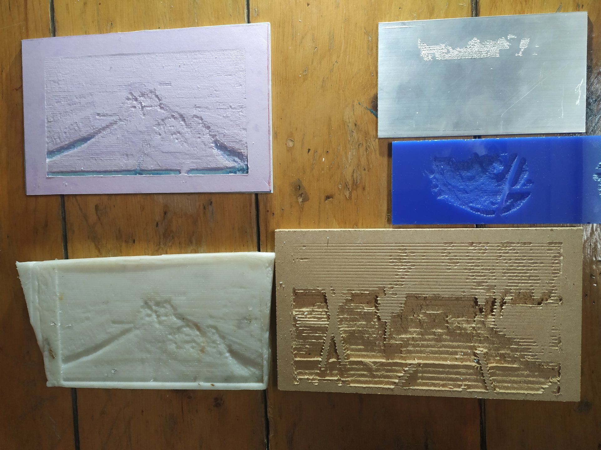
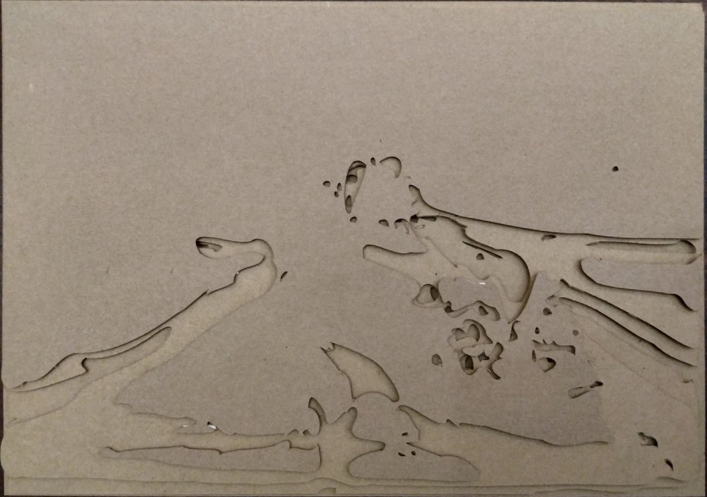
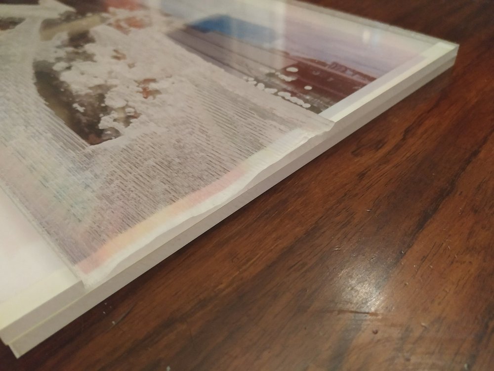
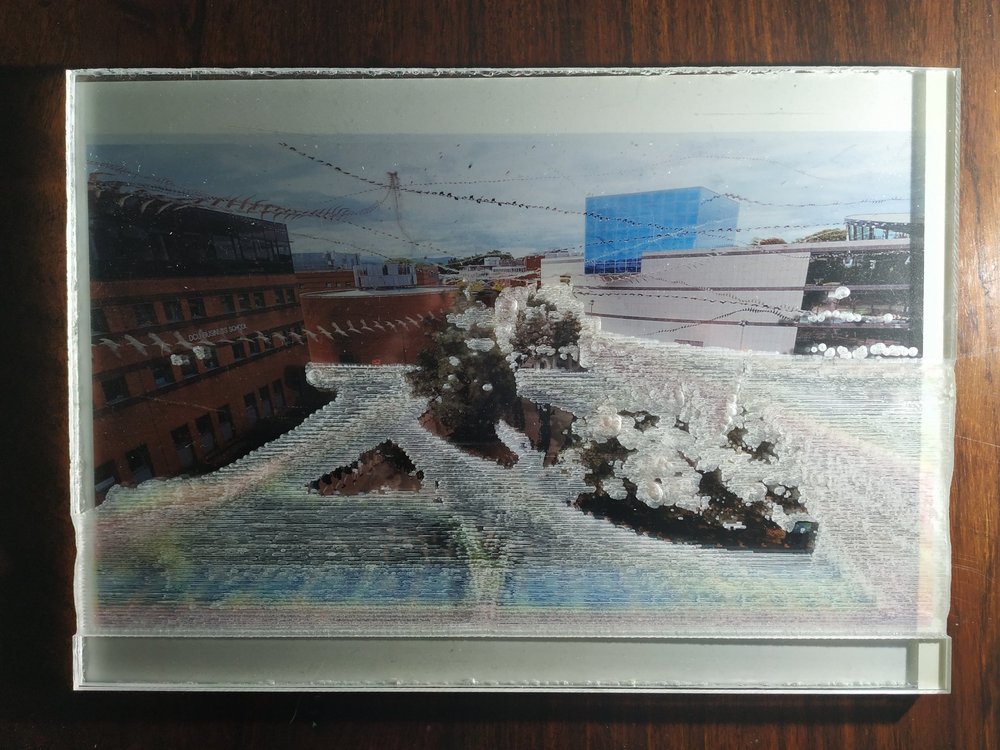
I have a small (roughly A4) CNC cutter which can create small prototypes. I experimented cutting the heatmap in cardboard, aluminium, various recycled and new plastics, and both solid and composite wood. The image above is an A4 photograph underneath a sheet of clear Perspex into which I have cut the motion intensity map, so it is possible to both feel and see the landscape of movement. One of the images above shows an edge detail of the deepest, most intense, areas of movement in the scene. (The photo showed more clearly after lightly polishing the Perspex overlay).
We had some conversations about placing Perspex textures over a display panel, or projecting an image onto the underneath, or projected directly onto a paler material. MDF sheeting had the best balance of being easy to cut while having a pleasing natural colour that is pale enough to project a video image onto.
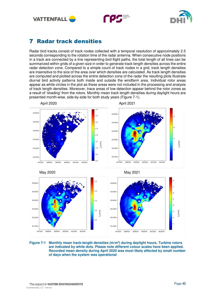
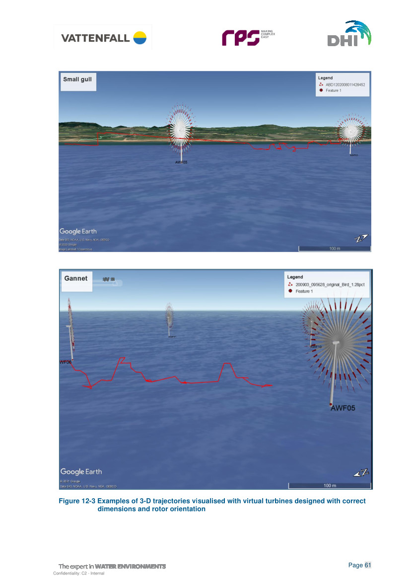
One interesting set of images we viewed when we were preparing these images for exhibition was a study called “Resolving Key Uncertainties of Seabird Flight and Avoidance Behaviours at Offshore Wind Farms” studying a similar set of issues. Seabirds have to fly through increasingly contested airspace to feed, and have species-specific patterns of flight tracks to avoid the risks associated with moving wind turbine blades. The study used similar heatmaps of seabird flight track intensity, although generated by combining radar detection with video species identification.
One could imagine creating an embodied sense of the seagulls’ navigation experience using these heatmaps, video imagery, audio of their calls and the weather, and tactile textures from the mapping analysis.
(Virtually) Travelling the World
I have video that I have recorded myself, mostly in Cork City and some while travelling. I also browse live video streams to look at shared public spaces, from Broad Street in Oxford to Davao City in the Philippines, and many other places between. I contributed my images from a collection of my own and streamed video to Magda Mostafa’s Sensory Atlas of experiences of cities around the world, to choose a few that exhibited well-defined patterns of pedestrian and other motion.
Time Space Existence, Venice Architectural Biennale 2023
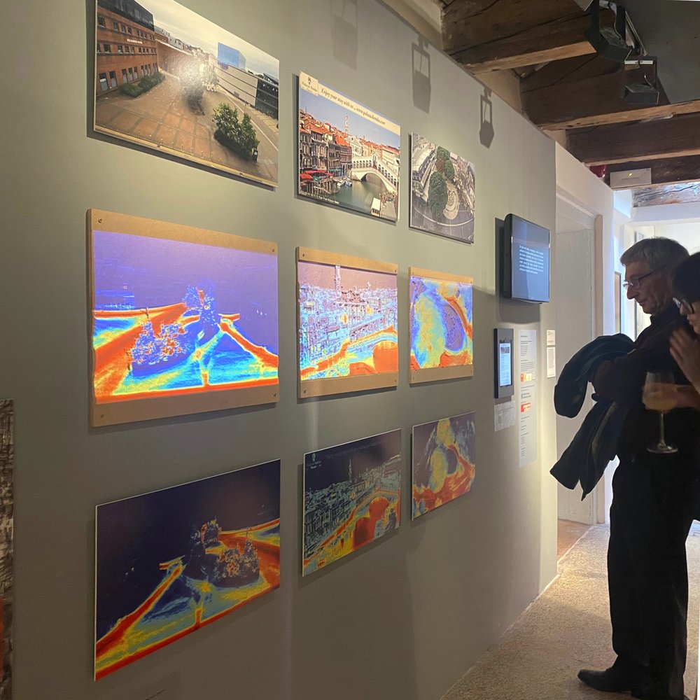
Three selected locations – Dublin City University, Rialto Bridge in Venice and Eleftheriou Venizelou Square (Lions Square) in Heraklion were chosen for the wall projection in “A Case for Sensory Decolonisation: Autistic Escape” curated by Magda Mostafa. This installation was part of the Time Space Existence Collection at the 2023 Venice Architecture Biennale, hosted at the European Cultural Center’s Palazzo Mora.

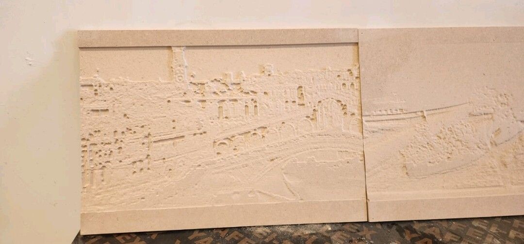
Magda Mostafa’s team at the American University Cairo cut full-size MDF tactile panels, arranged in a grid with a long exposure photo of the place above and the final heatmap below. A video loop transitions through the photo of the place, a timelapse of pedestrian and other movement, the developing heatmap, and the final motion intensity heatmap. The video starts with a fade from white, erasing any texture cut into the MDF surface. It fades out to black, with ambient lighting highlighting the depth of the cuts, as if the projected people have laser-cut the textured surface by walking on it.
The video is accompanied by continuous city street sounds of people walking, talking and doing everyday things. There is a sensory refuge made from acoustic sound-absorbing foam, with a stool from which to view the installation in comfort.
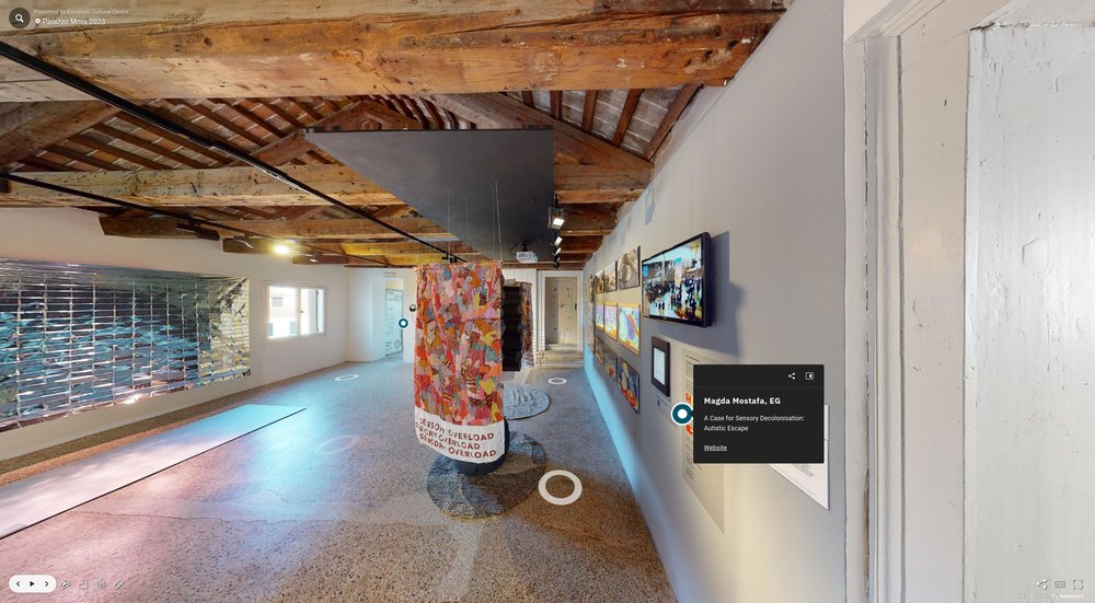
A virtual tour of the exhibition in Palazzo Mora is available on MatterPort.
The video walkthrough of the installation shows the video panels on the wall, with an explanatory exhibition loop on the display panel and a screen where visitors can record their own contributions to the Sensory Atlas. The walk proceeds around a sensory escape space made of acoustic foam and recycled fabric, to the introductory text and images.
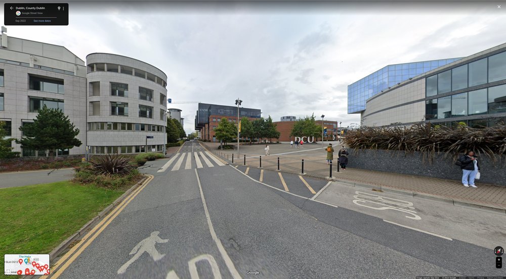
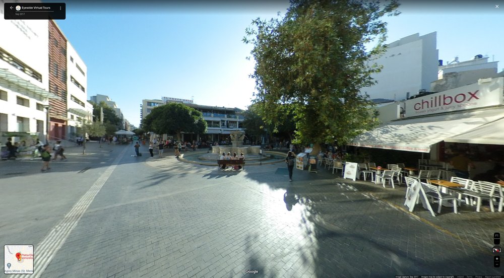
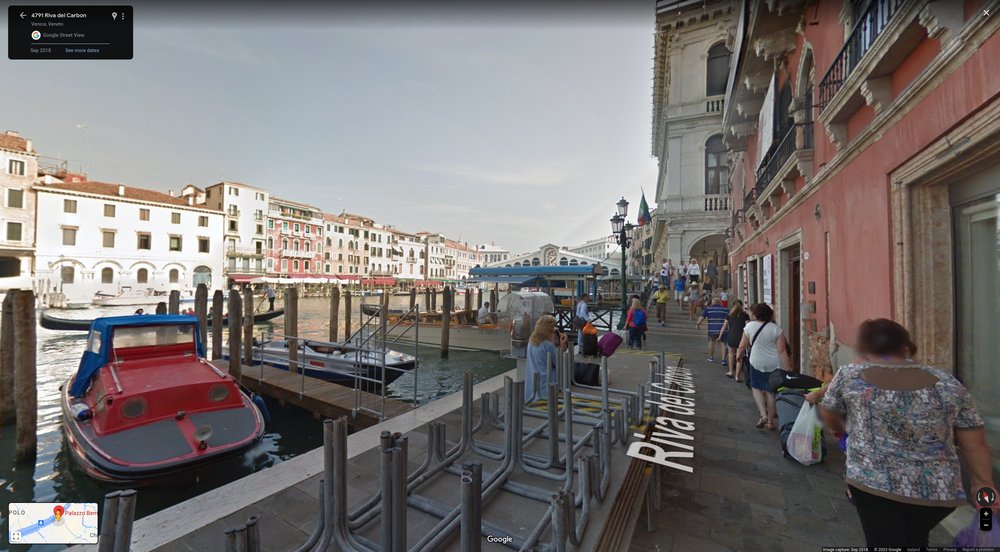
Google Streetview allows us see the pedestrian view of Glasnevin Campus, Lions Square and Rialto Bridge. Palazzo Bembo offers a roof-level live colour view of Rialto Bridge. The city council of Heraklion offers a live CCTV bird’s eye view onto Eleftheriou Venizelou Square (Lions Square). I recorded the Dublin City University video in person, from the top floor of the multi-storey car-park at the left of the image above.
The video display panels in operation.
The videos have to be either tightly synchronized or very evidently not synchronized, and we chose to synchronize the three loops to start and cycle in sync.
If the three videos were separately projected, with different lengths, their syncronization would shift over successive repeats of the loop, creating an ever-changing relationship between the three loops. If the three lengths were prime numbers, then the total repeat time, between all three videos starting in sync, would be the product of their length. With the primes 251, 257 and 263 seconds the videos would start together on the first day of Time Space Existence on 25 May and not repeat in sync for 16,965,341 seconds or 196 days, almost a week after the ending of the exhibition on 26 November. The mock-up above gives an impression of the visual landscape of ever-changing staggered start times, perhaps accompanied by an ever-changing landscape of de-synchronized ambient city sounds.
The Time Space Existence exhibition catalogue is available free from the European Cultural Centre website.
Semimaginary places
If we think about different kinds of camera (motion or depth sensing, composite generating) and different kinds of map (terrain, population density, footfall intensity), we can also think of mapping imaginary places and mapping real worlds in imaginary ways. These semimaginary maps provide a sense of how their designer sees or feels their embodied experience of the world. We could map Cork by the emotional intensity of its place names, or Ireland by the words used to describe autistic people, or stretch the topography to display “distance” to represent the time to reach places if you have no private car.
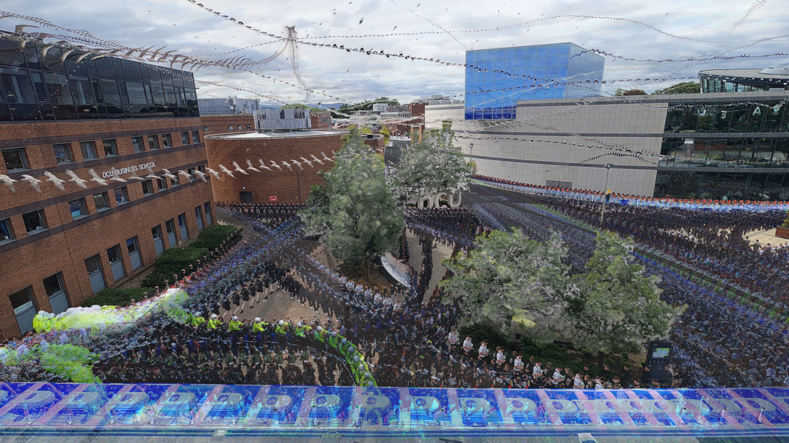
These two images represent experiences of viewing the busy main entrance to the Glasnevin Campus of Dublin City University (albeit from the safety of the top floor of the car park). We can immediately see the busiest paths from Collins Avenue past the Helix Theatre and into the Mall, and from the car park past the Business School. Some people pass between the Larkin Lecture Theatre and Business School, away from the busy Mall. There is a quiet space re-enforced by trees and long benches.
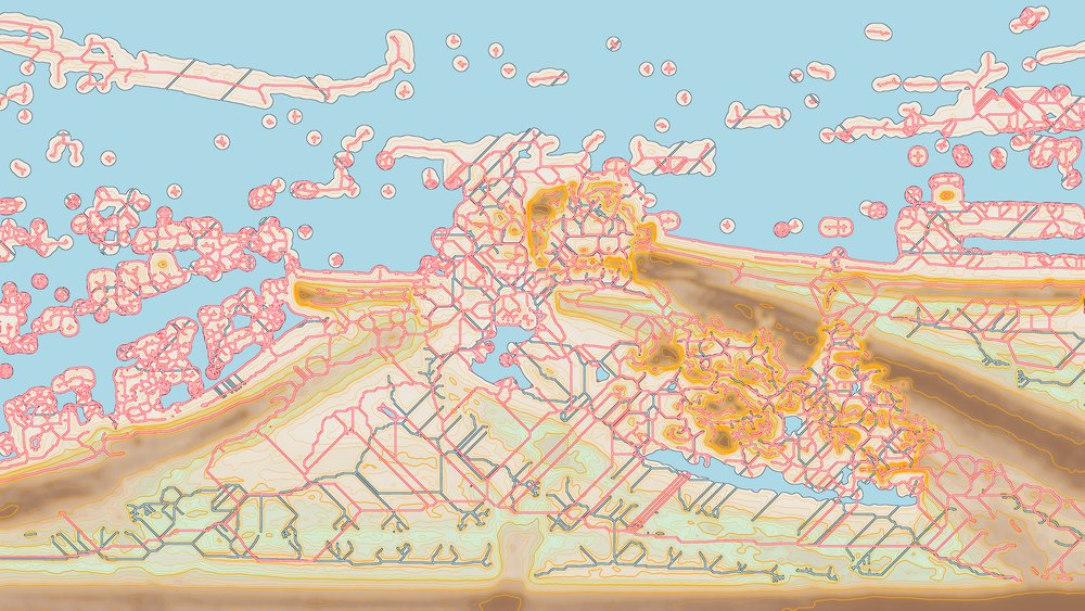
This is a semimaginary map of Glasnevin, using motion intensity as land elevation. Contour lines connect areas of equal intensity, as map contour connect equal height above sea level. The least intense areas are turned to water, creating a few lakes inland and a large sea that is mostly the sky – which is escape space for birds. Water channels flow through the locally lower paths towards the lakes and sea. Roads follow lines of minimum gradient and avoid passing over both water and high elevations.
We can imagine the water as flight-lines we might use to escape from the busy motion intensity, traveling at right angles (downhill, and the shortest distance) into sensory escape. Note an important and obvious point: rivers do not flow over mountains. The places we want or wish to use are, of course, the same places everyone else uses, and they do not seem as bothered by social and sensory overload. The high intensity, heavily trafficked areas create ridge lines that disconnect our world. A flight line into sensory refuge may be isolating, escaping into a place with no safe, calm route to the places we wish or need to go to, so we are stuck.
The roads follow lines of minimum gradient, avoiding both water and high land. The result is a set of imaginary paths that are largely parallel to the high intensity paths, connecting up the refuges and both sides of each ridge. Where roads cross a ridge, they do so by merging at a gentle angle, joining the stream of people without conflict, and exiting at a gentle angle. Sensory and social intensity are a cost of meeting our needs and wishes, and these imaginary roads provide a possible solution to minimizing discomfort while retaining access to the whole of our world.
I am more interested here in identifying the typologies of public space than in identifying specific features of an individual space. For instance, the gradient of motion intensity is an important feature in every place. A gradation of sensory intensity provides a choice of comfort level, so people can migrate into the intensity and speed that suits their own needs – which varies not just between people, but varies for individuals at different times, and in different moods. A flat motion intensity map would represent something like a lot of conflict (like a packed marketplace) or uniformity of purpose and speed (like an airport check-in route), neither of which offer sensory refuge or decompression areas. Some retail outlets deliberately organise their floorplans to flatten motion intensity, with the same footfall on every square metre.
Conclusion
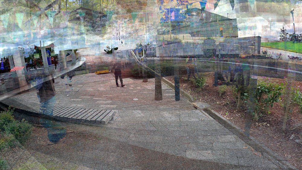
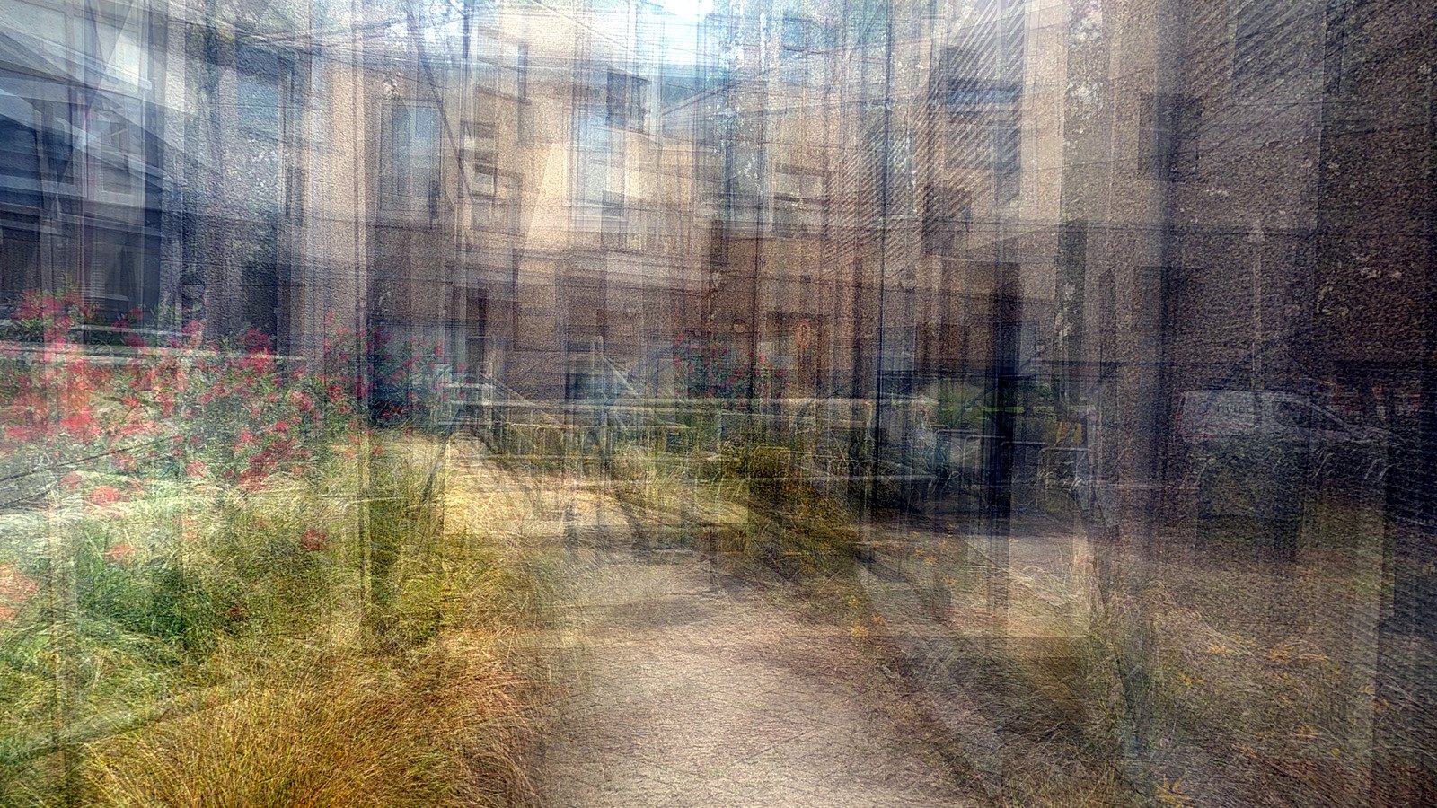
Sensory composites and motion mapping help me to capture and share my difficulty in identifying where to place myself in relation to movement. These final two images represent my own experience of the gradients within Dublin City University. I was not part of the process developing Dublin City University’s autism friendly campus programme, and created these images as a naive first-time visitor to the campus.
The first image is from a handheld video made whole walking through the busy main entrance to the Mall, past the Helix Theatre, with many people, a lot of poles, pennants, kerb edges, changing surfaces and street furniture along the path. The second is a less busy path from the Mall, with planting softening the landscape, a uniform footpath texture, and a degree of curvature to the two right-angle turns.
Exposing the intensity of movement and identifying types of sensory refuges helps me navigate to the places I want or need to be, and to explain my sensory experience of public space to other people.
More information
- “When We Design for Autism, We Design for Everyone“, Metropolis magazine
- Magda Mostafa’s ASPECTS™ Index
- The DCU / AsIAm “Autism Friendly University Design Guide“
- Time Space Existence, Venice Architectural Biennale 2023
- “Autistic Imaginaries of Architectural Space: The World from an Autistic Lens” curated by Magda Mostafa, Venice Biennale 2021