As part of another project, I started created “heatmaps” of the motion intensity into video recordings of everyday events. These are not images of literal heat, but assessments of the amount of visual change across the video field, converted into a coloured scale, where “heat” (from blue to red) is a readily-understood representation. My main motivation was to assess where and to identify what attracts attention, or distracts from attention, and to express how the environment feels from an autistic, attention-deficit (ADD/ADHD) perspective. These heatmaps of the amount and location of visual change became quite informative maps of how people use space, and how design constrains people from using space effectively.
(A minimal, fully-functional code sample is appended to the end of this post. You will need Python, and the OpenCV and Numpy libraries installed.)
Origins
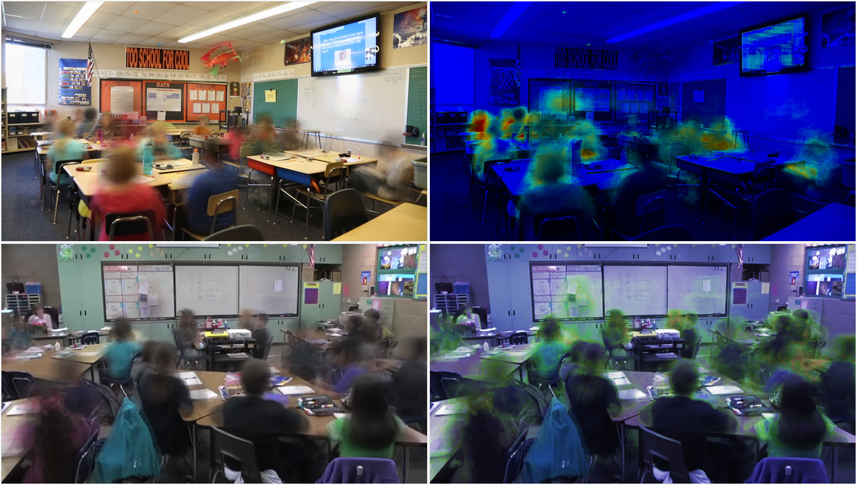
From the outset, my interest was how and why attention is directed or wanders, and how good framing and layout of space could minimise unpleasant distraction. When we attend to another human, they eyes and mouth are assumed to be primary elements of the interaction, and failure to “look at me when I am speaking to you” is taken as a sure sign of inattention, or cheekiness. And yet classrooms are designed with windows to the outside and to corridors, reflective surfaces, bright colours, vast amounts of fluttering class artwork, not mention the competing sounds, smells and other sensations that are often more immediate than the teacher or social contact. I assume, for the sake of argument, that the teacher and social contact are the main purpose of school, and should dominate the sensory experience.
I described more about body language and the speaker’s use of space in Listen to the tone of my body language, which is also displayed as an exhibition.
If we place a wide-angle video camera in a space like a classroom, and record ordinary video, it can be processed to generate alternative kinds of image. If successive frames are compared with each other, or each frame is compared with the average of all frames, it produces a measure of visual change. We could use simple brightness, or RGB difference, or changes in hue, depending on lighting and subject. I have found that the maximum of R, G or B is a good indication of visual change that performs well on a wide range of video material. I add up this measure of change for each pixel in the frame, for the full duration of the video sample. Then I scale these change values the range 0 (the pixel that changes the least) to 1 (the pixel that changes the most) and colour the frame from blue to red:
The samples of classroom activity are very revealing of the often-unnoticed visual distraction in a school, from unexpected objects with specular reflections of movement elsewhere, or the Windows screensaver on a whiteboard, to the very consciously distracting shuffling feet and waggling rulers. I described more about indoor spaces in Motion and attention in the classroom (or workplace).
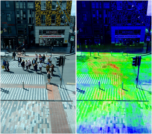
Shared public spaces
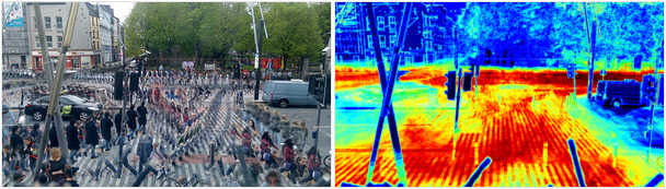
People follow desire lines, patterns that minimise tight turns and energy use, and break out of rectangular grids into sinuous exploration of the space. Infrastructure that contains a reasonable spread of desire lines will function. If a design, such as a pedestrian crossing, constrains desire lines too much, people will simply ignore it and the infrastructure becomes a hindrance more than a help. We can see in heat maps of pedestrian crossings that a substantial minority ignore any bounding lines or poles. People bunch up into tight spots of heat where bollards, lighting poles and waste bins constrain the crowd into a narrow space. There are spots of heat in the contested space where frequent desire lines cross, especially where they cross perpendicularly and less so where they converge obliquely.
I have looked at a variety of spaces around Cork City, mostly interested in the space allocated to pedestrians, and the narrow spaces large volumes of people are expected to squeeze through, with many where walking into the road and moving traffic is almost a necessity. The cool, blue spaces where any autistic or socially anxious person like me might need for calm and reassurance have been increasingly squeezed out of public shared spaces. A similar squeeze has happened inside many retail premises, where floor space is designed to enforce continuous movement and discourage browsing or dawdling.
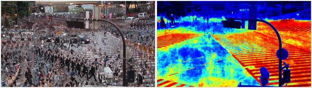

In the two images above, of Shibuya crossing in Tokyo, the density of people is so high that even with diagonal crossings to follow the most frequent desire line, there simply isn’t space to accomodate all the walkers. But having watched a live stream of this junction at quiet times, I can tell you there are always people outside the box.
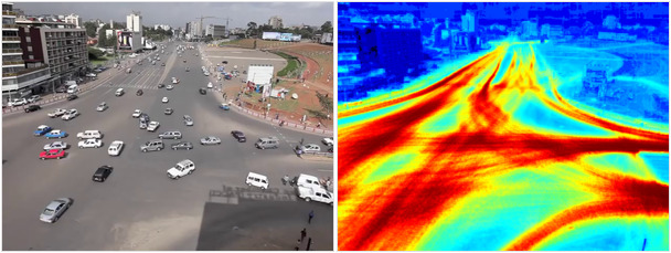
When infrastructure doesn’t contain social animals (which humans, usually, are) they negotiate their own use of space, turn-taking and safety. The vast unmarked junction close to Meskel Square in Addis Ababa, in the images above, has no priorities, lane markings or traffic lights, yet drivers (and brave pedestrians) manage to turn-take and define their own collective use of the space. I imagine that constraint with lights and lanes would be both safer and increase the flow, but it is an interesting illustration of cooperation.
If we take away the danger of high-speed collision, pedestrian spaces are much more interesting and (from my perspective, having never driven) much more relevant.
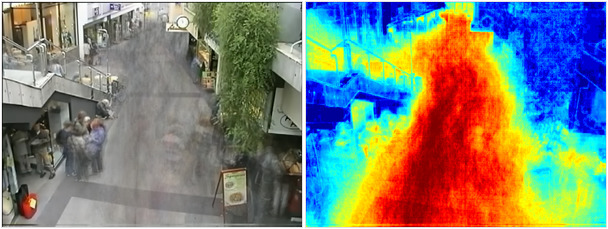
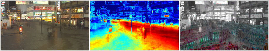
In the images above there is a composite of all frames on the left, showing a group of people sheltering in the overhang of the stairs, and several individuals and groups beside and behind a sandwich board that limits the flow of pedstrians. The heat map shows this to be the hottest zone, the area of greatest footfall where the stairs and ground floor flows converge. The space seems almost undesigned, with a great deal of conflicting flow and a lack of space for people to exit the flow and window-shop or rest. The siting of the pot plant and sandwich board seem almost perversely obstructive, but presumably protect business at the bakery, where customers would wish to queue without being jostled. The cool spaces under the stairway overhang and around the sandwich board are interesting areas of relative calm, which people seem to have consciously or unconsciously been drawn to out of the flow of the crowd.

The street furniture, benches, telephones, waste bins and advertising can be used strategcally to zone space. In the image above, a pedestrian thorughfare has been separated into a high-intensity, low-speed zone up against the shop fronts on the right, and a high speed, low density route in the centre. The two zones are separated by a quiet zone of benches, phoneboxes and waste bins where people can sit or stand out of the flow on either side. The route is pedestrianised, but fully accessible to cyclists, disabled drivers and delivery vehicles.
Dotonbori in Osaka is a pedestrianised district popular at night, as dining and entertainment space. This video is streamed from a camera facing outward from the front of a building housing multiple restaurants. There is a large area of calm to the left, around the entrance to public toilets. Even with such a wide space, people are attracted to the motion-shadow created by two lamp posts. A group standing there act as a barrier, intensifying the flow in the centre of the thoroughfare. Most people avoid the steps, the zones between shop signs and sharp turns.
In the third image, people in motion have been coloured by their direction, showing a collective negotiation of ‘lanes’, where people tend to follow in the wake of the person in front, with the crowd separating into clear, temporary paths. It would be possible to reinforce these, with angled obstructions (such as benches) or inclines to encourage more consistent laning in heavily trafficked areas.

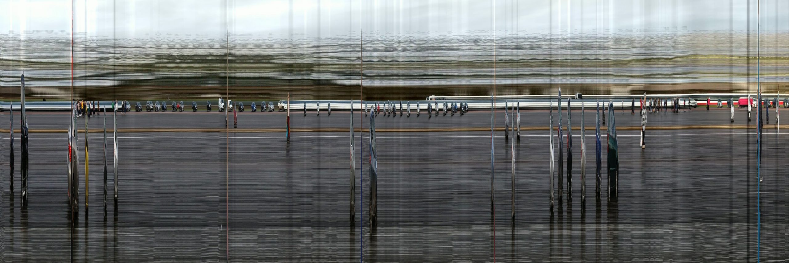
The London Eye is on a riverfront site, with a large building creating a linear, contained pedestrian area. Despite its size, most of the width has been appropriated into private use and fenced off from te pedestrian thoroughfare. A high volume of traffic is also placed into conflict with a queue into a fastfood restaurant at the top right, the ‘hottest’ zone due to the large number of people entering and leaving a narrow entrance. Most of the area denied to pedestrian traffic is unused until the evening, creating a large – and inaccessible – area of calm. The remaining area to rest is a bench on a pedestal between flagpoles, but sited in such way as to maximise the intensity of the passing crowds (and minimise the calm of anyone who sits there, “in the way”).
Intervention – changing space
It would be really interesting to record video and make heatmaps of the same space before and after some kind of intervention, with the same lighting, time of day, season and pedestrian flows. However, an unintended consequence of the pandemic is the ability to compare recordings under broadly similar conditions before and during Covid-19. The main outcome is a vastly reduced pedestrian flow, but no great evidence of social distancing within the reduced flow – if anything, the small numbers of people are highly congregated even where space is available to pass safely.
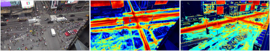
Before the pandemic, Times Square had a pedestrian footfal with a visual change intensity equal to the vehicular traffic and electronic signboards. Clear desire lines formed across the pedestrian square, connecting with the snack outlets, public seating and crossings over the roads. During the pandemic people are far less evident than vehicles (despite walking being a safer mode of transport), and congregate around the few remaining street entertainers and takeaway coffee stands.
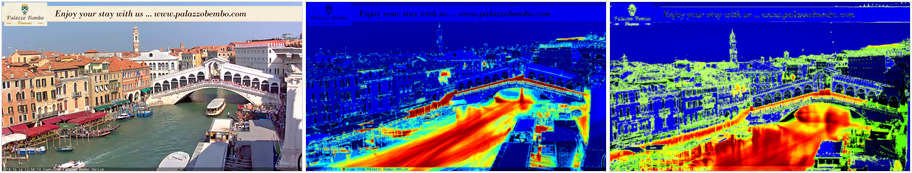
Before the pandemic, the flow of tourists over the Rialto Bridge, along the quays and the T Fondaco rooftop terrace was so intense that it exceeded the visual intensity of the river traffic. The heat is now greatly dispersed over a much wider area, the rooftop custom is much lower and boat traffic is more visually intense. The overall intensity is now so much lower that occasional birds appear in the heat map (top, to the left of the rooftop terrace).
The video above is streamed video I saved from the Rialto Bridge in Venice in October 2018 and from Times Square in New York in July 2019, before the pandemic, on the left hand side. I revisited these locations, although the Times Square camera has been moved to another building, and collected streamed video in March 2021, during the Covid-19 pandemic. All four video sequences represent 10 minutes of real time, speeded up. The fall in people walking and cycling is dramatic. With more systematic adherence to the time of day, day of week, season and so on, these could be useful measures taken from video cameras – an extremely cost-effective sensor given the volume and spread of data a moving image reveals.
It is not science… yet
The measurement of visual change in video is no less objective than many other kinds of measurement and, assuming consistent lighting and recording environments, could be a useful measure to trial the impact of interventions in footfall. A diagonal barrier or bench on a path would redirect flow, separating walkers in opposite directions. A large pot plant centred on the point where two desire lines interstect would separate and de-intensify the conflicting use of space. Moving signposts from the centre of a lobby would redirect lost and confused walkers away from high traffic routes while they get their bearings.
It would be interesting to test the impact of some kind of intervention using visual heatmaps of footfall.
Other social motion
In common with my earlier work, I have continued looking at the way events feel, and how to communicate the feeling of an event from an autistic and ADD perspective to people who may perceive events differently – or even not notice the event that distracts me.
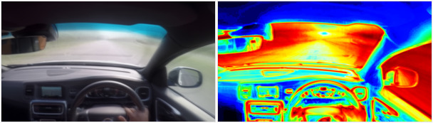

I don’t drive and never learnt. I suspect this is part of the reason – there is so much going on, so many indicators crying for attention, all equally loudly (even the ones that don’t matter, like the radio), and all as loud as the road ahead. The car in the lower images, a BMW, has matt and non-reflective interior fittings, taking less attention with reflections, apart from the glove compartment cover. The driver also uses both hands to steer, unlike the top image where the driver keeps one hand on the gearstick.
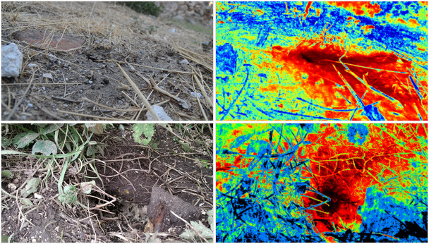
If you see someone lying in the dirt staring at a hole in the ground, or at the underneath of leaves, or cobwebs, that might be me. The top pair of images show an established ants’ nest in Mystras in Greece. The ants emerge scattered over the earth, merging with the flow of ants returning from whatever the endpoint of the forage was. The heatmap on the right shows two clearly separate routes the ants were foraging on. The second image shows wasps building a new nest (in October, in Monaghan), with the heatmap showing a single, almost vertical flow of wasps into and out of the nest.
The video also allows some interesting measurements. The slit scan (through the vertical centre) shows the individuals entering or leaving through the duration of the video. The ants in Mystras passed through the slit 550 times per minute, 275 return journeys and (assuming they use all sunshine hours) more than a quarter of a million foraging trips per day.
There are software techniques to recognise and count geometries, such as lines, line-tips, or bounded shapes. The number of individual ants can therefore be counted by eye, or estimated by shape recognition.
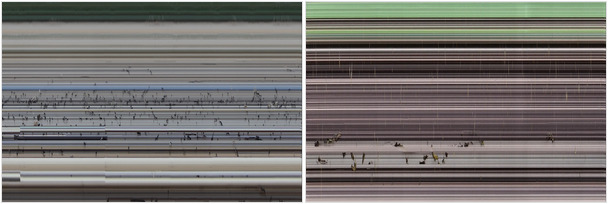
A similar slit-scan of people, mostly patients, crossing between Cork University Hospital and the bus stops. Approximately 60 pedestrians per minute cross during the 30-second pedestrian phase, as compared with approximately 22 (mostly single-occupant) vehicles per minute during the 2 minutes and 30 seconds vehicular traffic phase.
Resources
- I have used ImageMagick and bash scripting to prototype some ideas, and then written code in Python using the Open Source libraries for Computer Vision (OpenCV).
- Ffmpeg or similar utilities are useful to save, transcode and edit recorded or streaming video.
- Linux is your best friend.
- There are online galleries of my exhibitions. The video of Creating Autism has a lot of material in just 9 minutes.
Heatmap code sample
The following code sample will open a video file (or webcam, streaming video etc) and grab frames continuously until no more frames are available. It then saves the last frame as a reference image, a normalised (i.e. from fully black to fully white) heatmap, and a colourised heatmap, after equalising the histogram.
Save the code as “video-heatmap.py”, make it executable and run it in a terminal command line as “video-heatmap.py <file>”. The code should run on most platforms with Python available, and the OpenCV and Numpy Python libraries installed.
You might wish to experiment with other measures of “difference”, e.g. the root-mean-square of RGB difference, or reduce sensitivity to brightness using hue (convert to HSL). You might wish to divide by the number of frames (i) instead of normalising, or remove the equalisation step in the colour map (which produces a more even spread of colours).
#!/usr/bin/python

import sys
import cv2
import numpy as np

# Use: "video-heatmap.py [filename]"
filename = sys.argv[1]

capture = cv2.VideoCapture(filename)

# Exit if video / camera did not open successfully
if (capture.isOpened()== False):
  print("Error opening video stream or file " + filename)
  exit()

# Capture first frame and initialise variables
ret, frame = capture.read()
if ret == True:
  framediffsum = np.zeros_like(frame).astype("float32")
  frameprev = frame ; i = 1

  while(capture.isOpened()):
    ret, frame = capture.read()
    if ret == True:
      # Absolute difference between successive frames, select maximum of BGR, convert to single channel gray
      diff_colour = cv2.absdiff(frame, frameprev)
      diff = cv2.max(diff_colour[:,:,0], cv2.max(diff_colour[:,:,1], diff_colour[:,:,2]))
      diff = cv2.cvtColor(diff, cv2.COLOR_GRAY2BGR)
      framediffsum += diff
      frameprev = frame ; i = i + 1

    # Break the loop
    else:
      break

# Release the video capture object
capture.release()

# Normalise heatmap to range 0-255, save as greyscale image
heatmapbw = cv2.normalize(framediffsum, None, alpha=0, beta=255, norm_type=cv2.NORM_MINMAX, dtype=cv2.CV_8UC1)
# Create a colour image, equalise histogram, convert grey to colour map "Jet"
heatmapcol = cv2.cvtColor(heatmapbw, cv2.COLOR_BGR2GRAY)
heatmapcol = cv2.equalizeHist(heatmapcol)
heatmapcol = cv2.applyColorMap(heatmapcol, cv2.COLORMAP_JET)

# Save a sample frame, normalised b&w heatmap and colourised equalised heatmap
cv2.imwrite(filename + "-frame.png", frameprev)
cv2.imwrite(filename + "-heatmap-bw.png", heatmapbw)
cv2.imwrite(filename + "-heatmap-colour.png", heatmapcol)